

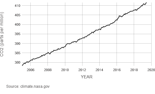
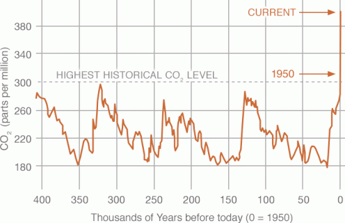
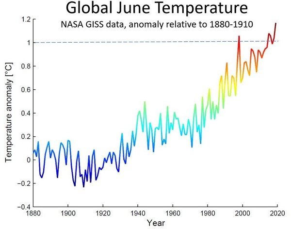
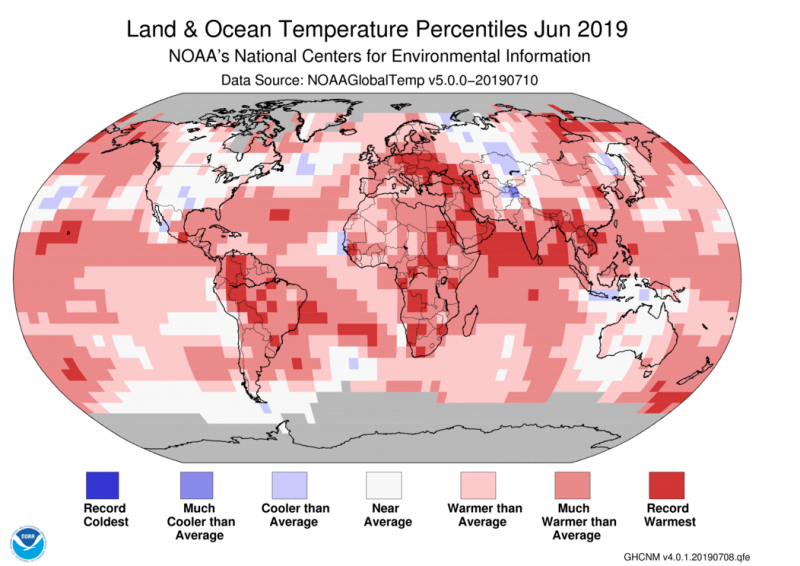
הגרפים נלקחו מאתר נאס”א בחודש יולי 2019, והם מציגים מצב שהיה נכון לחודש יוני 2019.
הגרפים מתייחסים לריכוז פחמן דוח חמצני באטמוספירה (אחד מגזי החממה שגורמים להתחממות הגלובלית ואשר ריכוזו עולה כתוצאה מפעילות של בני אדם, שריפת דלקים פוסיליים, פליטות מחקלאות, מפעלי תעשייה, תחבורה יבשתית ימית ואווירית,
NASA – Global Climate Change – Vital Signs of the Planet
Published 31/7/2019, Updates on a monthly basis
Carbon Dioxide LATEST MEASUREMENT: June 2019
412 ppm (Parts Per Million)
Carbon dioxide (CO2) is an important heat-trapping (greenhouse) gas, which is released through human activities such as deforestation and burning fossil fuels, as well as natural processes such as respiration and volcanic eruptions.
The first graph shows atmospheric CO2 levels measured at Mauna Loa Observatory, Hawaii, in recent years, with average seasonal cycle removed.
The second graph shows CO2 levels during the last three glacial cycles, as reconstructed from ice cores.
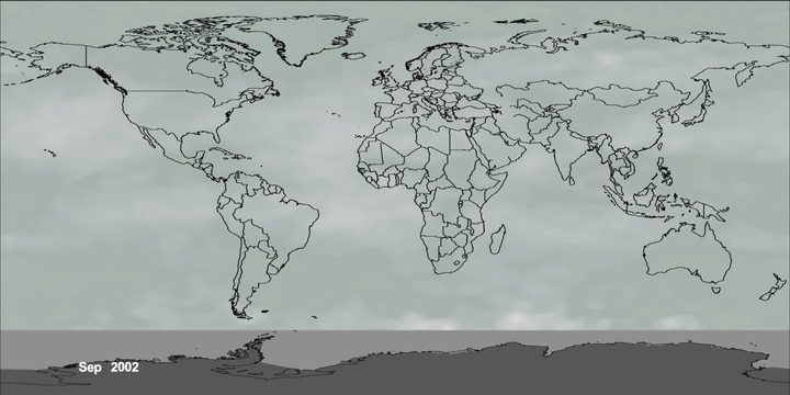
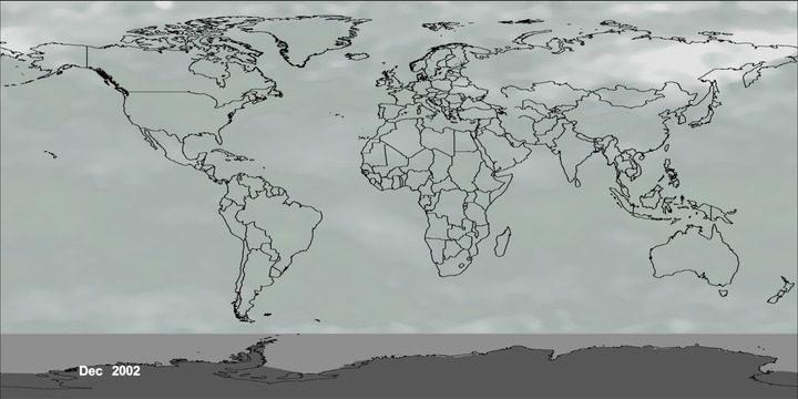
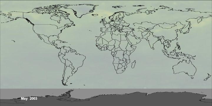
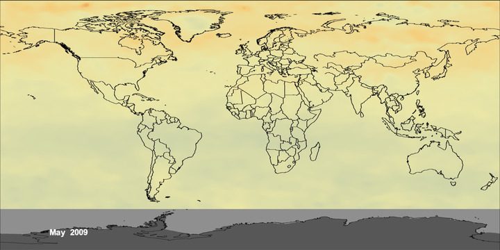
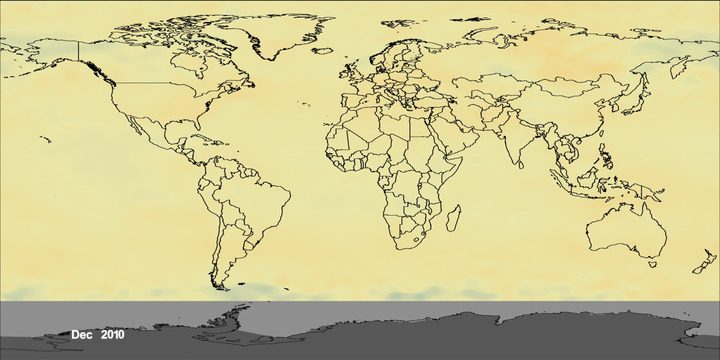
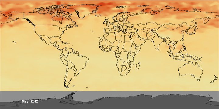
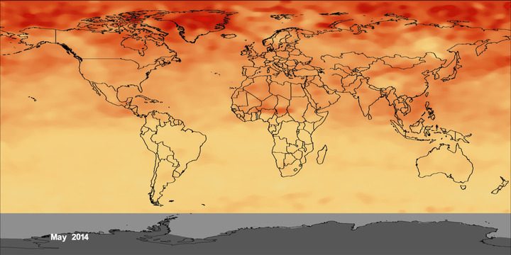
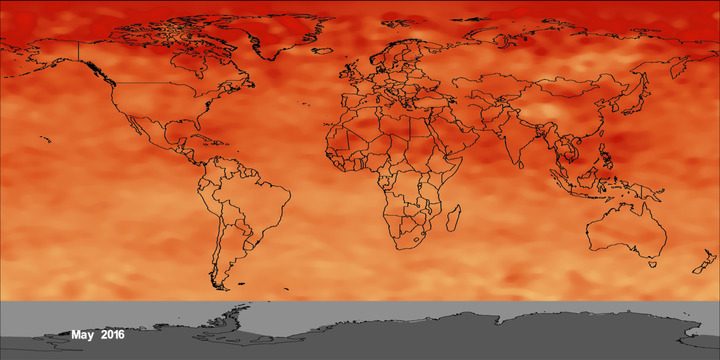
The time series below shows global distribution and variation of the concentration of mid-tropospheric carbon dioxide in parts per million (ppm). The overall color of the map shifts toward the red with advancing time due to the annual increase of CO2.

Global Temperature
LATEST ANNUAL AVERAGE ANOMALY: 2018
0.8 °C
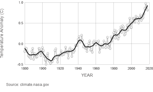
This graph illustrates the change in global surface temperature relative to 1951-1980 average temperatures. Eighteen of the 19 warmest years all have occurred since 2001, with the exception of 1998. The year 2016 ranks as the warmest on record. (Source: NASA/GISS). This research is broadly consistent with similar constructions prepared by the Climatic Research Unit and the National Oceanic and Atmospheric Administration.
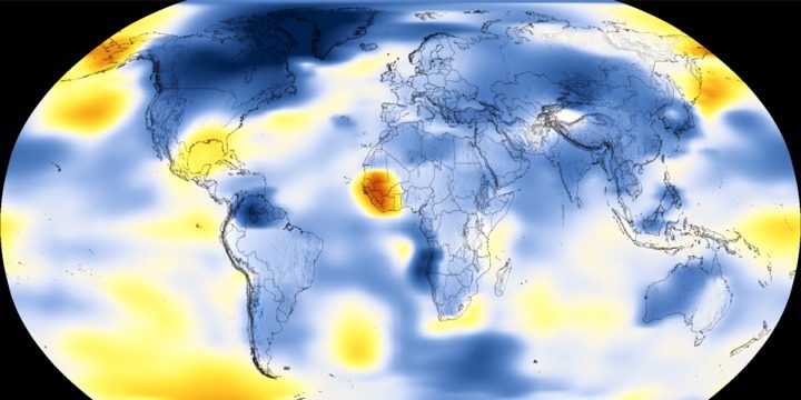
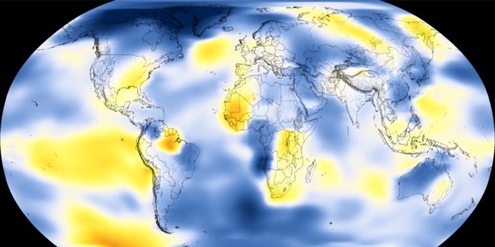
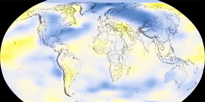
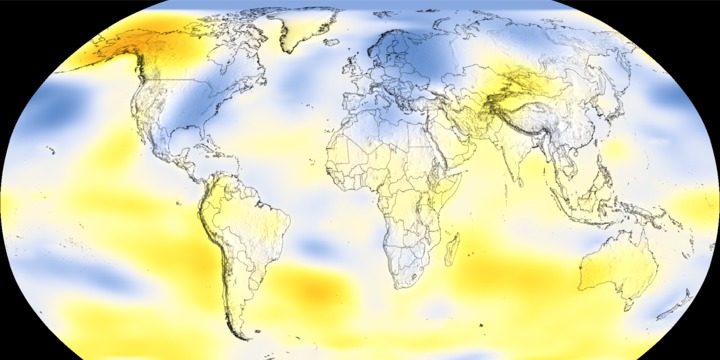
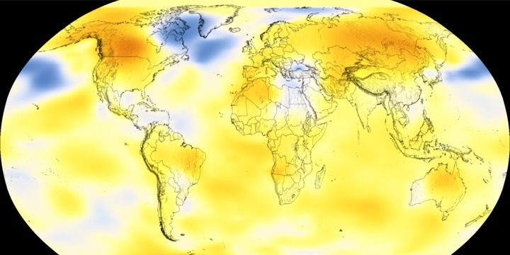
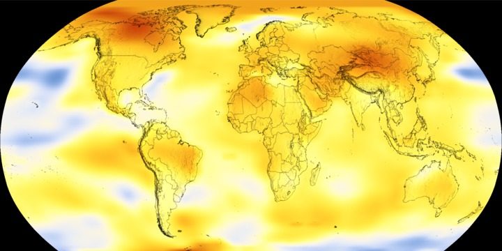
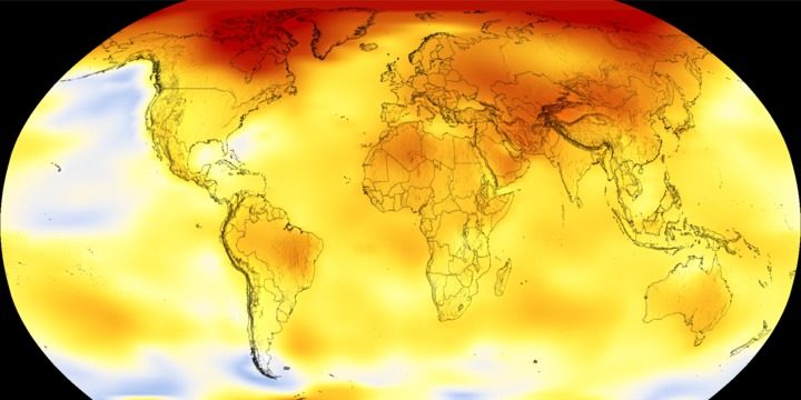
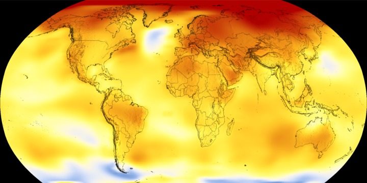
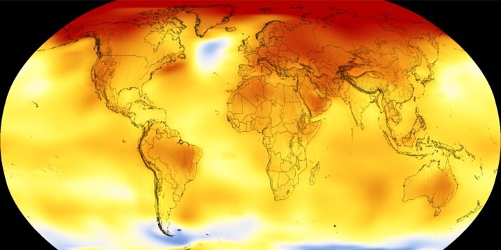
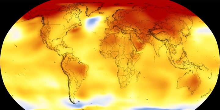
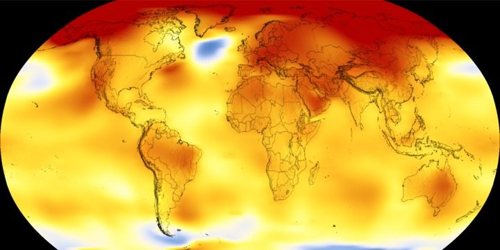
The time series below shows the five-year average variation of global surface temperatures. Dark blue indicates areas cooler than average.
Dark red indicates areas warmer than average.
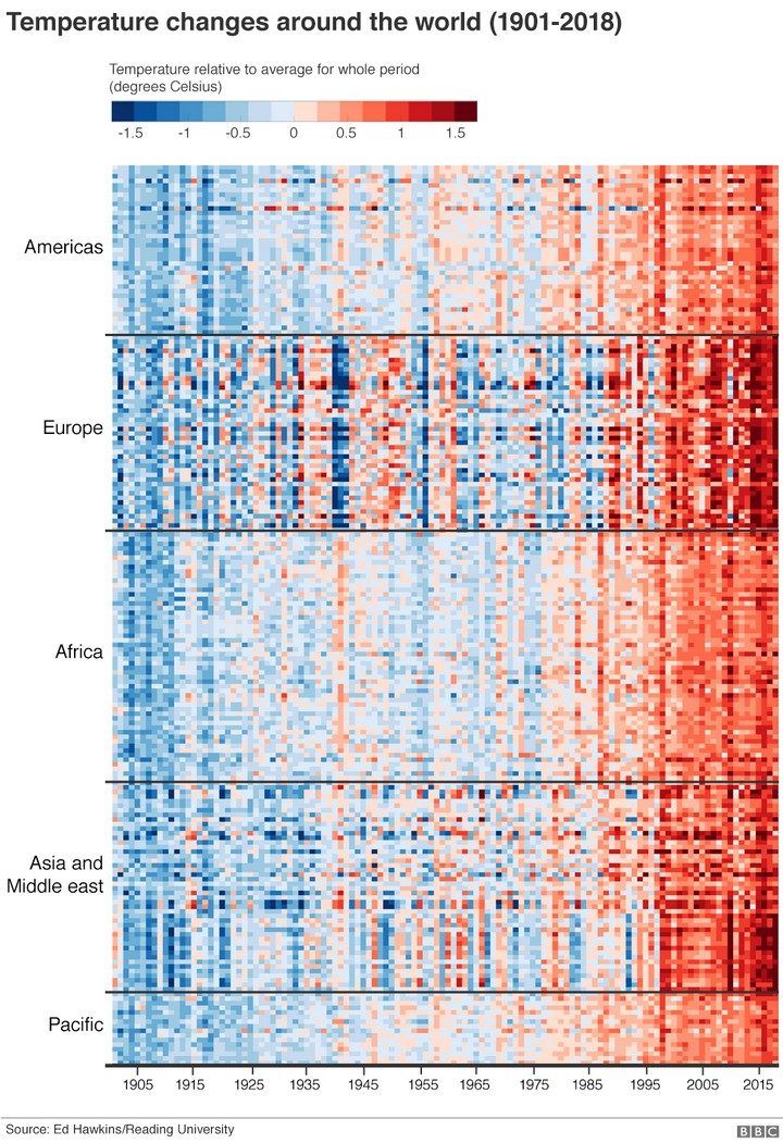
The chart that defines our warming world
The chart below organises all the countries of the world by region, time and temperature. The trend is unmistakeable.
Each line of coloured pixels is the temperature record of an individual nation within its region, stacked one atop the other. Blues are cooler years; the reds are warmer. The far left is 1900; the far right is the present day.
The entire planet has got hotter, increasingly so in recent decades.
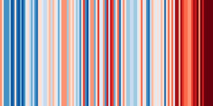
This global “Climate Stripes” graphic is the work of Prof Ed Hawkins at Reading University who has sought clearer ways to communicate the issues around climate change – and to start conversations that might lead to solutions.

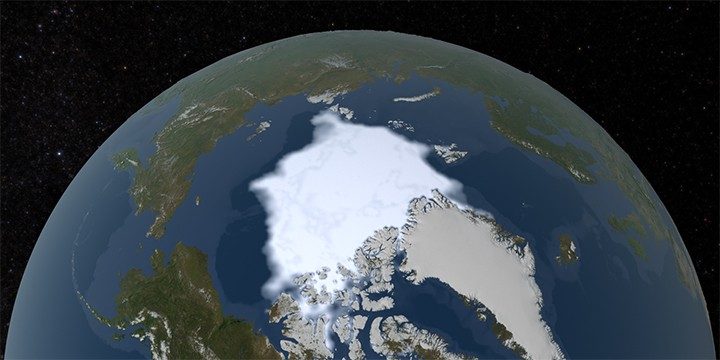
Arctic Sea Ice Minimum
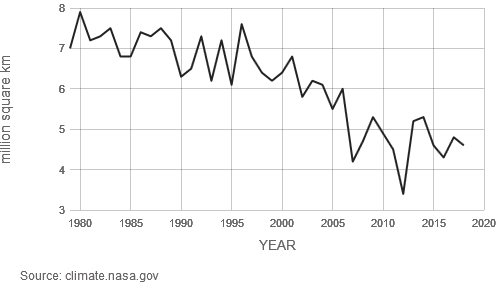
Arctic sea ice reaches its minimum each September. September Arctic sea ice is now declining at a rate of 12.8 percent per decade, relative
to the 1981 to 2010 average. This graph shows the average monthly Arctic sea ice extent each September since 1979, derived from satellite
observations.
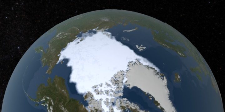
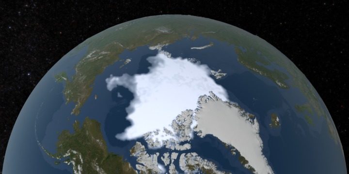
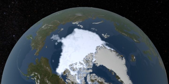
The animated time series below shows the annual Arctic sea ice minimum since 1979, based on satellite observations. The 2012 sea ice
extent is the lowest in the satellite record.
Ice Sheets
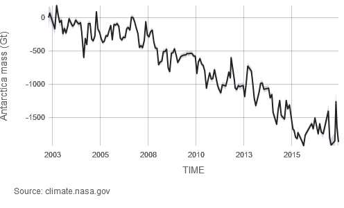
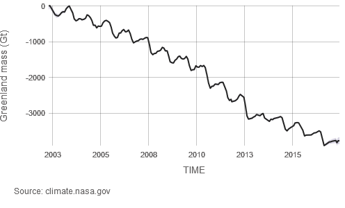
Data from NASA’s GRACE satellites show that the land ice sheets in both Antarctica (upper chart) and Greenland (lower) have been losing mass since 2002. Both ice sheets have seen an acceleration of ice mass loss since 2009. (Source: GRACE satellite data)
Please note that the most recent data are from June 2017, when the GRACE mission concluded science operations. Users can expect new data from GRACE’s successor mission, GRACE Follow-On, in the summer of 2019.
IceSea Level
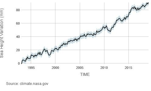
LATEST MEASUREMENT: February 2019
91 (± 4) mm
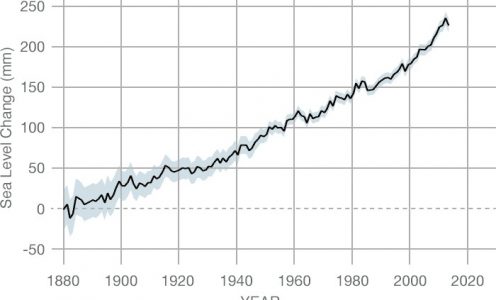
Sea level rise is caused primarily by two factors related to global warming: the added water from melting ice sheets and glaciers and the expansion of seawater as it warms. The first graph tracks the change in sea level since 1993 as observed by satellites.
The second graph, derived from coastal tide gauge data, shows how much sea level changed from about 1870 to 2000.
Source: NASA – Vital Signs
קבל התראה מזדמנת לתיבת הדוא”ל